The Condition of Stamps
Stamps come to us in different conditions. Is the stamp torn? Is it dirty? Those are undesirable conditions.
Is the stamp bright? Are all the perforations there? Is the image in the stamp well centered
with respect to the perforations? Is there a nice cancellation mark that is easy to read?
Those are signs of a desirable stamp.
Most of us want to collect the best stamps we can. We want to be able to say: "Hey, this stamp is in great
condition. I want it for my collection." Or, we might say: "This stamp is in poor condition, because it has a
small tear in it. However, I will keep it until a better one comes along."
Sometimes we cannot actually see the stamp we want to obtain. For example, suppose your stamp-collector
friend in a different city tells you she has that stamp she knows you want,
and she will trade it to you. It would be very useful for you both to be able to describe the condition
of the stamp. You cannot see the stamp, so she tells you it is in "very fine" condition.
That makes you happy and you decide what you are going to offer as a trader for it, because you want that
stamp!
The only way that will work is if you both can agree about what "very fine" means. Stamp collectors use words
like "poor", "good", "fine", "very fine", and "superb" to describe condition. These descriptions are
meaningful only if we agree on the factors used to describe the condition, and how those factors are evaluated.
We need a standard to go by. Stamp catalogues base their pricing on condition, and provide a guide to
evaluate the condition. These guides provide the standard we are looking for because they have been adopted
by stamp collectors and dealers.
Below is a table adapted from the Specialized Catalogue of Canadian Stamps published by
Unitrade Associates. There are many others, but this
one serves as an example.
| Condition | Description | Example |
| Very Fine (VF) |
Gum On early issues, part of gum or no gum; later issues,
complete undisturbed gum with no faults. May be hinged.
Colour Fresh and bright, no fading.
Paper Free of all defects.
Centring Design well centred, distinct margins on all sides.
Cancellation Light, clear, well-positioned.
|
 |
| Fine (F) |
Gum May be disturbed slightly, due to heavy, multiple or improper hinging.
Colour Not as fresh as VF, but no fading.
Paper No tears, thins, creases, etc. in the paper.
Centring Considerably less margin on one or two sides, but must be clear of stamp edges on
imperforate issues, and clear of perforations on other issues.
Cancellation Any clear postmark is acceptable.
|
 |
| Very Good (VG) |
Gum Disturbed or partially missing.
Colour Some fading.
Paper Defects such as creases or staining are apparent.
Centring On imperforate issues, the frame line is just cut into by the edge of the stamp
on one or two sides. Perforations touch or cut the design on other issues.
Cancellation A medium cancel covering more of the design than in Fine condition.
Cancellation not necessarily legible.
|
 |
You will also see stamps that are called "superb", which means they are even nicer
than VF; and stamps called "good", which means they are not as nice as VG.
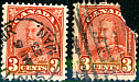
Here are several used copies of the same stamp, a 3 cent red stamp showing King George V, issued
in 1931. Even though this stamp is close to 100 years old, you can still buy a decent used copy for less than a
quarter because so many of them were printed. Who says collecting old stamps has to be expensive?

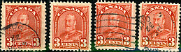
Which of these stamps would you prefer for your collection? Counting from the left, forget the third one
over (call it #3). It is badly torn and not worth even being a "space-filler". If you don't like cancellations,
you might like #5. But it is centred a bit low, with a larger space at the top, between the stamp and the
perforations.
If you like a nice cancellation, particularly a circle with readable names and dates (called CDS,
a circle date stamp), try 1, 2, 4 or 7. Which
is the best centred and the most pleasing? Number 1 has that nice "selvedge" or sheet margin attached at the left
and bottom edges, but again, centring is not great. Number 4 has great centring and wide margins
on the sides, but is that a damaged perf at top left? For me, 2 and 7 are the best of this group, but we can
do even better, so we should keep looking. But take the best looking one for now.
More on condition
